pastel furniture
UX AUDIT · 2018 PROPOSAL
Pastel Furniture is a B2B furniture manufacturer that specializes in indoor barstools, office chairs, and dinette sets. Pastel’s current website serves as an online catalog for our sales force, dealers, and vendors. It is also an avenue for Pastel to showcase their new product launches. Pastel’s website was originally outsourced to a third party vendor; however, in early 2014, the Marketing Department decided to bring this operation in-house. Despite having zero to none web development background, I was given the opportunity to redesign and redevelop the website. Our decision was to move forward with a WordPress platform. With the new skillsets I have acquired from my UX/UI design intensive course, I believe Pastel’s website should undergo another redesign to enhance our viewers experience and to help drive sales. Several design elements can be improved and additional features should be added. I conducted an UX audit, submitted my proposal, and we are reviewing how we can go about implementing these changes.
competitive analysis.
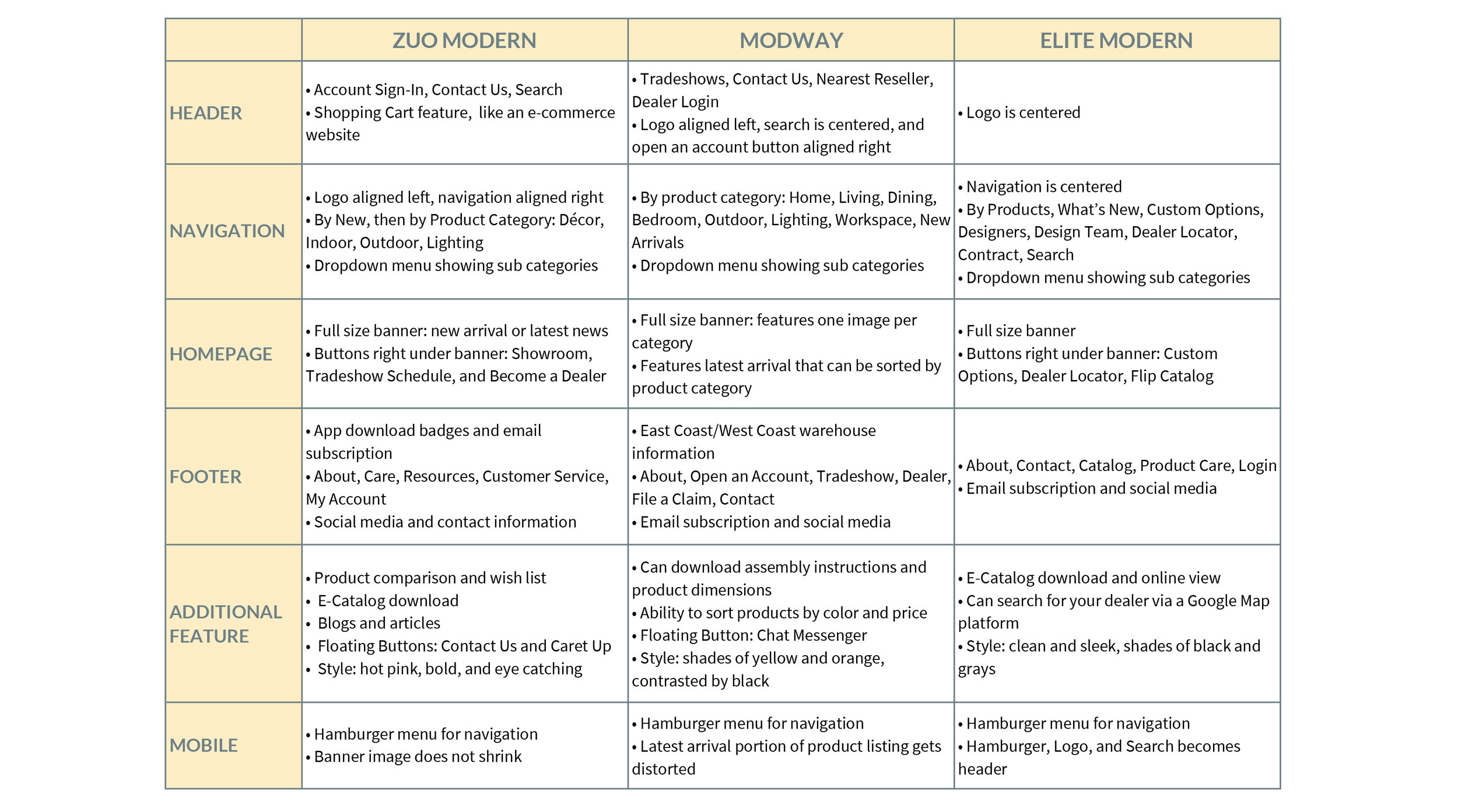
I conducted a competitive analysis on three of Pastel’s competitors to compare the overall shopping experience on both desktop and mobile devices. Zuo Modern, Modway, and Elite Modern are all B2B furniture manufacturers specializing in indoor furniture for the residential and hospitality markets. They all service overlapping clienteles with that of Pastel’s—specialty stools and dinettes stores, e-commerce, designers, and purchasing firms.
major findings.
The homepage and the site in general could benefit from engagement techniques and better navigation/sub navigation system. Reorganization of the content would help solve this confusion.
Visual design overall is adequate but suffers from few consistency issues. How to better display product information in a visually pleasing and logical manner, without overwhelming our customers, is key to driving sales.
The mobile experience is decent but requires fine-tuning. Currently, the mobile experience is basically a desktop squished into the mobile view. By focusing on what is really needed on the mobile device, it will help in getting rid of the clutter.


