perfect properties
UI DESIGN · PROJECT CONCEPT
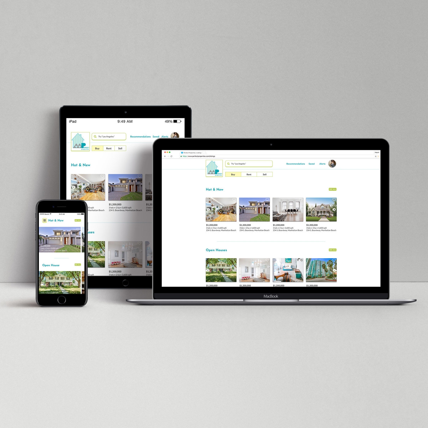
Perfect Properties, a responsive web app for mobile, tablet, and desktop, provides real estate seekers with information of interest. The app features a minimalistic, yet modern design allowing its users quick access to recommended listings, property information, as well as customizing his or her own unique search criteria.
After all, finding the perfect property shouldn’t be hard.
user stories/user flows.
I started the project by developing different user flows for each task. Majority of the user stories centered around the idea that app users need to be able to set up his or her own unique search criteria in order to find personalized and relevant property listings.
low-fidelity wireframes.
I moved forward with paper prototypes to jump start the iterative design process. As I sketched out my low-fidelity wireframes, I would reflect back to my user flows to ensure that all the screens required for each tasks are sketched out.
grid & spacing.
It is extremely important for UI design to present a pleasing aesthetic for its users, and I approached this by using a 12 column grid via Sketch. The grid system brought structure to my visual designs, enabled a consistency across multiple screens, and allowed me to visualize where to and where not to place design elements.
mid-fidelity wireframes.
Now that I have a visual blue print of my screens, I transformed my low-fidelity wireframes into mid-fidelity wireframes using Sketch. During this process, my focus was on UI elements, visual hierarchy, spacing, as well as UI design patterns. This is where I made a drastic change to my design layout because I wanted my real estate app to feature a modern and urban feel since a lot of the existing real estate apps out in the market are more old school and structured.
mood board.
This is where I researched and incorporated visual design principles and trends into a mood board. My mood board followed two brand guidelines (1) colors should be tones of green or blue and (2) appearance of the app should be clean, quick, and smart. My mood board strategically incorporates bright and bold shades of turquoises and lime, toned down by complementary colors. The colors are energetic, modern, and encourages creativity, fun, and happiness. At the end of the day, looking for your dream home should be fun and enjoyable!
high-fidelity wireframes.
First, I made the huge decision to switch from a tool bar navigation system to the hamburger menu. Then, having determined the color scheme, typography, imagery, and finally iconography, I was able to start and finalize all my high-fidelity wireframes using Sketch. During this time, I also reflect back on mobile interactions and gestures I envisioned for my app. I created a mini-animation using Keynote that represents the horizontal scroll feature for my “set search criteria” screens.
style guide.
As stated previously, Perfect Properties is a responsive mobile app for mobile, tablet, and desktop. To ensure consistency across the different media platform, a style guide was essential. My style guide includes UI elements, logo guidelines, colors, typography, iconography, imagery, as well as do’s and don’ts.
responsive design.
Here you will find the final mockup of my tablet and desktop breakpoints. The three screens I focused on were (1) splash page, (2) recommended listings, and (3) search page.


